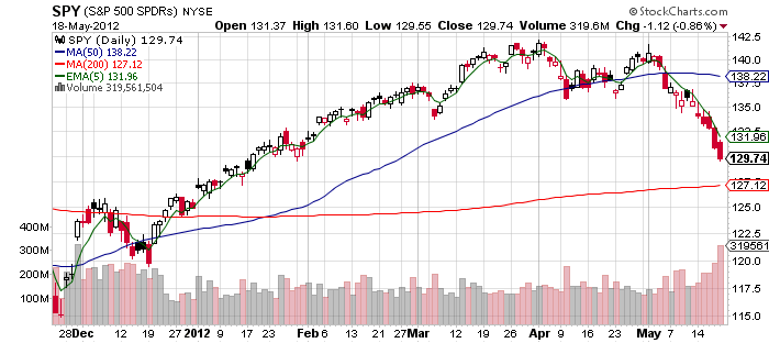
This past year has been just like the chart studies I have done. Using the $SPY as the market filter in late December 2011 we had a break above the 200 day then a retest with support, we had confirmation of an up trend beginning in January 2012 with the market trading above the 200 day and holding it as support. It was a time to get long as stocks broke out above their 50 day and 200 day moving averages. For my short term trend trading method I chose $AAPL and $PCLN as my two long stocks primarily in the 1st quarter. As long as they closed above the 5 day exponential moving average I stayed long. I played the long side primarily through April and into May and locked in profits if my stocks lost the 5 day ema and did not regain by the end of the day. As the market lost its 50 day moving average I switched to shorting only using $RIMM $PCLN and $JPM as my primary short plays as the market started a down trend. I knew we were in a confirmed down trend when the market would open close to the 5 day ema then rally to it and sell off as smart money was unloading shares and adding to their short positions. My chart reading is not in hindsight, as my twitter followers know this is what I read on the chart as we went and the positions I took to profit from the move in real time. Our next test could be at or near the 200 day moving average we could bounce here at any time and retake the 5 day ema or we could find support at the 200 day and reverse from there. If the 200 day is lost and not retaken by the end of the day that will be a vary serious bear market alert. Of course I do not predict I simply try to read what market participants are doing by looking at the chart and right now they are selling at the 5 day ema. However when this changes my short positions will change.
