Technical indicators are tools used on a chart to quantify entry and exit signals to create good risk/reward ratios for trades. They are ways to measure risk by setting stop losses and profit targets. They can be used to build strategies as filters inside a price action trading system. Technical indicators are a way to become objective about a chart by measuring volatility, momentum, trends, or variation from the mean price.
What are the top 5 most widely used technical indicators?
- Moving Averages (SMA, EMA)
- Relative Strength Index Indicator (RSI)
- Moving Average Convergence Divergence (MACD)
- Bollinger Bands
- Anchored Volume Weighted Average Price (AVWAP)
1. Moving Averages (SMA, EMA)
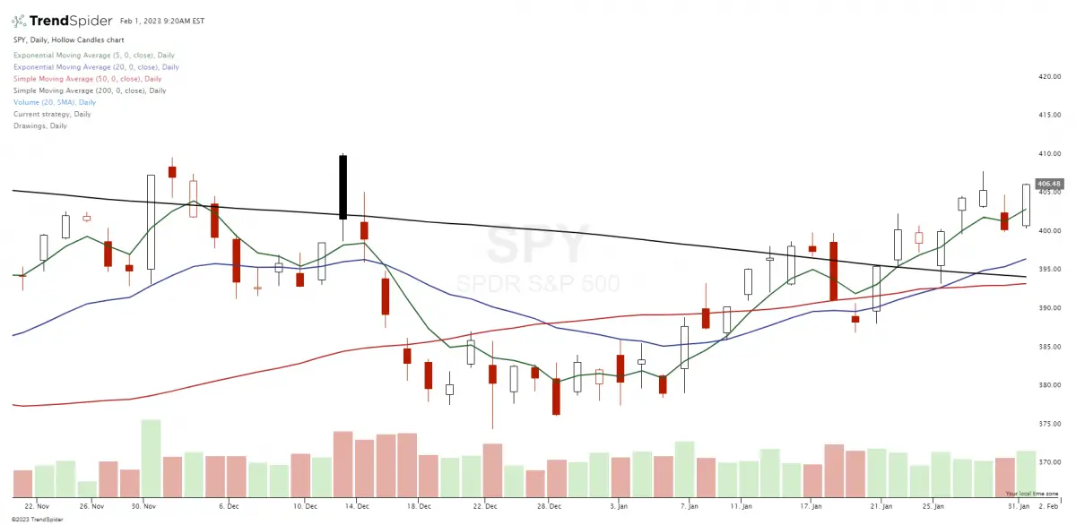
Moving averages are technical trading tools that help identify trends in different time frames. They can replace opinions and predictions for trading decisions by being used as signals. Moving averages can identify trends and price action swings in real-time and signal range-bound markets when they go flat with no directional curve.
Moving Average Filter
Moving averages are technical trading tools for capturing trends and swings on a chart.
Moving averages are price action filters that can identify a trend by which side of a moving average price is trading on.
A vertical moving average can show that a chart is in a trend, while a horizontal moving average can show that price action is going sideways in a trading range.
The slope of a moving average can visually show the magnitude of a trend direction.
Moving averages can act as key support or resistance levels in trading ranges and trends.
Moving Average Indicator
A moving average is a line on a chart that represents the average of prices over a specific timeframe; it changes as the price changes in the timeframe it represents.
Moving averages are technical tools that traders use to identify trends on charts.
A simple moving average is just the average of prices in the timeframe, and an exponential moving average gives more weight to recent prices and changes faster when reacting to new prices.
Moving averages can smooth out price action for trading trends.
Moving average crossover systems can further smooth out volatility for holding positions during a trend.
Moving averages are for trading trends and are not as helpful during sideways markets.
Billionaire Paul Tudor Jones and multi-millionaire Ed Seykota’s both incorporated moving averages into their successful trading systems.
Moving averages are quantified signals, unlike trend lines that can be discretionary and based on opinions.
Moving averages can be backtested for their viability as profitable signals.
Moving averages can be used as entry signals, stop losses, profit targets, trailing stops, and discretionary trading tools.
Moving Average Crossover Strategy
A moving average crossover signal is when you use both a short-term moving average and a long-term moving average on the same chart. A crossover signal is generated when the moving averages break above or below each other. A trader buys when the shorter-term moving average crosses over the longer-term moving average and sells when the shorter-term moving average crosses back under the longer-term one. Instead of the price crossing over or under a single moving average as a signal, the shorter-term moving average becomes the signal line as it crosses over the longer moving average. The best thing about moving average crossover signals is that they can capture trends and swings in price action while filtering out much of the volatility.
Using backtesting software, you can set up an entry signal for when a shorter-term moving average closes over a longer-term moving average. Then you can set up an exit signal for when the shorter-term moving average closes back under the longer-term moving average.
I have run backtests on the moving average crossovers and have found them to be the most useful in trading trends and swings with charts that are in overall long-term uptrends—many of the best ETFs and growth stocks for momentum and trends backtest well using moving average crossover strategies.
Here are some of the most popular ones I looked at.
5-day / 20-day ema crossover: Flying Eagle crossover
5-day / 30-day ema crossover: Flying Falcon Crossover
8-day / 21-day ema crossover Scott Redler’s favorite
10-day / 30-day ema crossover: Flying Squirrel Crossover
10-day / 50-day ema crossover: Flying Dragon Crossover
50-day / 200-day ema Golden Crossover
They work because they create good risk/reward ratios by letting winners run and cutting losers short. They also put a trader in a position to be with the overall trend in their time frame. They give exit signals as trends end and will signal when it is time to get back into a chart on an upswing. Moving average signals can save traders from significant losses during bear markets and downtrends.
2. Relative Strength Index Indicator (RSI)
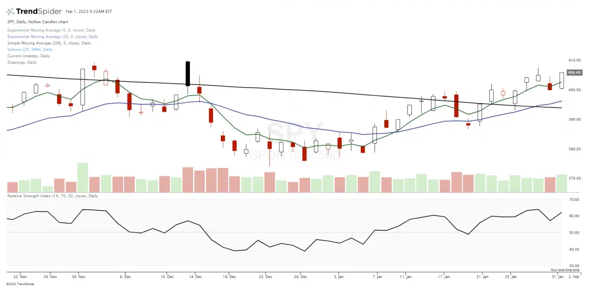
The RSI indicator strategy uses the Relative Strength Index to make buy and sell decisions on a chart based on oversold and overbought readings versus the price of a stock or security.
What Does the Relative Strength Index (RSI) Measure?
The Relative Strength Index (RSI) is a technical indicator that traders use to quantify the price momentum on a chart. The RSI measures the magnitude and speed of price moving in one direction on a chart. RSI readings are on a scale from 0 to 100, but over 90% of the readings will usually fall within the 30-70 range on most charts. RSI readings below 30 indicate that the stock is likely oversold, and RSI readings above 70 indicate that the odds are a chart is overbought. Oversold simple signals that the price likely went down too far and too fast, and overbought signals a chart has gone up too far and too fast. The RSI is primarily used as a reversal signal at chart extremes. The RSI is usually set on a chart below the price action to see how it correlates to price movement. The standard default setting on a chart for the RSI is 14 periods.
What Is an RSI Buy Signal?
Popular RSI buy signals are when a chart reads RSI-30, the price bounces back higher after reaching the RSI-30 zone, or the price drops below but breaks back over the RSI-30 reading on the chart. All these signals show that the chart is likely oversold in its time frame, and the odds are it at least bounces back for an upswing in the short term.
The RSI dip buy works best on charts in primary uptrends with an upward bias. During downtrends, the RSI can continue to go lower and lower. It’s usually not a high probability of success to hold long positions under the 30 RSI reading as it shows a lack of buying support.
What Is an RSI Sell Signal?
Popular RSI sell and sell short signals are when a chart reads RSI-70, the price falls lower after reaching the RSI-70 zone, or the price rises above but breaks back under the RSI-70 reading on the chart. All these signals show that the chart is likely overbought in its time frame, and the odds are it at least drops back lower for a downswing in the short term.
The RSI short signal can work on charts after long-term uptrends or the first big rally in a downtrend. During parabolic uptrends, the RSI can continue to go higher and higher, so stop losses must always be used if the price breaks back over the RSI-70. It’s usually not a high probability of success to hold short positions over the 70 RSI reading, as it shows incredible buying pressure breaking through that level.
The RSI-70 zone is usually a good place to lock in long-position profits as the risk/reward ratio no longer favors much higher prices in the short term. The RSI-30 zone is usually a good place to lock in short-position profits, as the odds of going much lower are low.
What does RSI 50 indicate?
The RSI-50 can signal that a chart is range bound and going sideways will have a little momentum in either direction if that reading holds over time. The RSI-50 can also be considered an overhead profit target for long positions entered at the RSI-30 zone or a lower profit target for a short position opened in the RSI-70 zone. Wide trading ranges can also be bounded in the RSI-30 to 70 range or the RSI-50 to 70 range.
The RSI indicator is not a magic predictor of future price action. It’s a technical tool for creating a strategy with a good risk/reward ratio and high probability signals for managing trade entries and exits.
3. Moving Average Convergence Divergence (MACD)
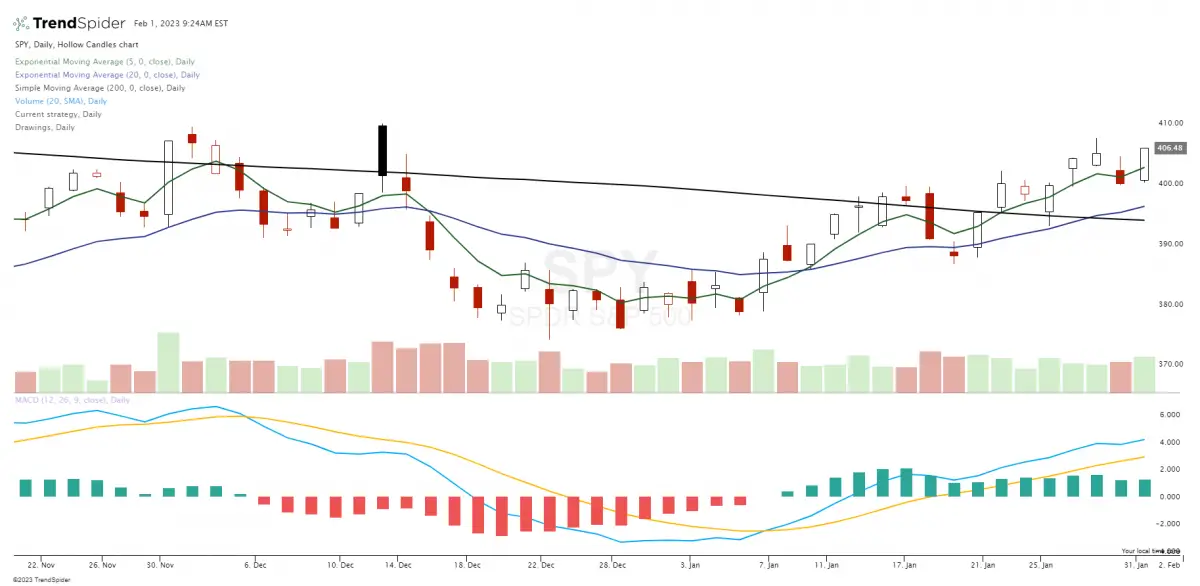
MACD (Pronounced Mac-Dee) is the short abbreviation for the moving average convergence/divergence technical indicator. The MACD is a trading indicator used in technical analysis to filter and trade the momentum of price action on a chart. The late Gerald Appel created it in the late 1970s as a tool for technical analysts. It was created to visually show changes in price strength, direction, momentum, and duration for trends and swings in the price action on a chart.
The MACD is a simple visual momentum indicator. The MACD takes two moving averages that act as trend-following indicators and creates a momentum oscillator by subtracting the longer-term moving average from the shorter-term moving average. This formula creates the MACD as a double indicator for trend identification and momentum magnitude. The MACD lines fluctuate above and below the zero line on the histogram as the moving averages come together, crossover, and separate.
How to use MACD:
Traders can wait for signal line crossovers, center line crosses, and divergences as potential trading signals. The MACD is not bounded inside set parameters, so it’s not a good tool for identifying extended overbought or oversold price levels. It’s a trend and momentum indicator and shows the current direction of a move.
The MACD is calculated by subtracting the 26-period Exponential Moving Average from the 12-period EMA. The answer for the calculation is the MACD line. A nine-day EMA of the MACD is called the signal line. This is the faster signal line that shows with the MACD line and can act as a crossover trigger for buy and sell signals in the direction of the price move to capture trends or swings. Many traders may use it as a buy signal when the stock shows the signal line crossing above its MACD line and then lock in profits when the signal line crosses back below the MACD line. The MACD indicator can be used in many ways, but it is commonly used for crossovers and divergences to create signals.
The bullish signal line MACD crossover can show momentum and a possible swing higher in price that can evolve into a sustained trend. A bullish crossover can happen near a price bottom after a rally off the lows or when the price emerges out of a price range. A bearish MACD signal line cross-under can show the loss of momentum early when a trend turns into a range and fails to make new highs. A bearish MACD cross under can also signal the beginning of a downtrend and the end of an uptrend. The MACD works best when used with other technical indicators for confirmation. For example, if you use MACD crosses to get into a trade, you could use the Relative Strength Index (RSI) to exit and lock in gains as a chart becomes overbought with a 70 RSI zone or oversold with a 30 RSI zone. Also, if you have a key moving average crossover signal on a chart, a bullish MACD cross can confirm the trade with a confluence and give the trade greater odds of success.
The MACD can help with trading price action on a chart by showing the current directional bias and key turning points.
4. Bollinger Bands
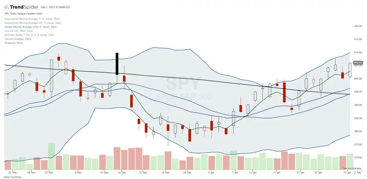
Bollinger Bands are a technical indicator created by John Bollinger in the 1980s. They were created to form a quantified visual trading range adaptive to dynamic volatility expansion and contraction.
“Bollinger Bands are use a measure of central tendency as a base such as a moving average. They curves drawn in and around the price structure usually consisting of a moving average (the middle band), an upper band, and a lower band that answer the question as to whether prices are high or low on a relative basis. Bollinger Bands work best when the middle band is chosen to reflect the intermediate-term trend, so that trend information is combined with relative price level data.” – John Bollinger
Bollinger Bands are a technical trading tool universal to all markets and trading time frames. This indicator was designed to show if prices are high or low on a relative basis for the chart. It shows if the price is high in the upper band or if the price is low in the lower band. This information is valuable for both ranges and can show when a trend is about to emerge outside the bands. Volatility is based on the standard deviation, which changes as volatility increases and decreases. The bands automatically widen when volatility increases and contract when volatility decreases. It is an excellent addition to a trader’s parameters and helpful in the context of a confluence of other technical indicators.
Bollinger Bands consist of a middle band with two outer bands. The middle band is a simple moving average usually set at 20 periods. A simple moving average is used because the standard deviation formula also uses a simple moving average. The look-back period for the standard deviation is the same as for the simple moving average. The outer bands are usually set 2 standard deviations above and below the middle band.
A move in price to the upper band shows strength, while a price move to the lower band shows weakness. During range-bound markets, price action will stay within the bounds of the bands. During strong up trends price will ride up the upper band pressing it higher; during strong downtrends, the price will push against the lower band and force it lower. A break outside one end of the bands can be a parabolic trend signal in the direction of the breakout. In sideways markets, the price will revert from the upper or lower band to the middle 20-period moving average after reaching the top or the bottom band. If the price exceeds the 20-period moving average, it signals an uptrend. If the price is below the 20-period moving average, it signals a downtrend.
“According to Bollinger, the bands should contain 88-89% of price action, which makes a move outside the bands significant. Technically, prices are relatively high when above the upper band and relatively low when below the lower band. However, “relatively high” should not be regarded as bearish or as a sell signal. Likewise, “relatively low” should not be considered bullish or as a buy signal. Prices are high or low for a reason. As with other indicators, Bollinger Bands are not meant to be used as a stand-alone tool. Chartists should combine Bollinger Bands with basic trend analysis and other indicators for confirmation.” – StockCharts.com
5. Anchored Volume Weighted Average Price (AVWAP)
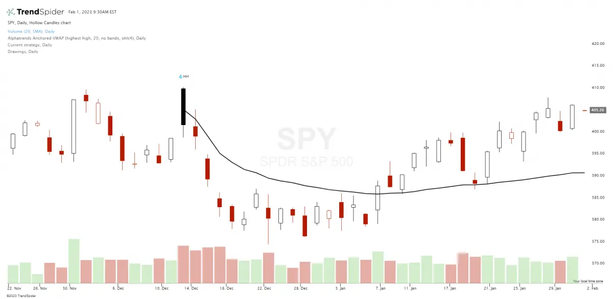
Anchored volume weighted average price, or AVWAP, is a previous meaningful benchmark price on a chart chosen by traders that quantifies the average price a market has traded at through a time period, based on both volume and price. This metric is important because it provides traders with a visual of the nature of the trend and the average technical value of a stock from a defined starting point.
The theory behind the anchored VWAP is like much of technical analysis: charts have memory based on past key levels of transactions. Old resistance can become new support as traders that missed the breakout buy their second chance to get in at that price, as one example. A lot of price action happening at one price level can create new price action based on memory in the future based on an anchoring bias. People that missed a gap breakout may want to buy when the price pulls back to the initial level of the gap.
The VWAP line shows one line on a chart anchored to a chosen starting point and can be for any timeframe. Some traders use the VWAP as one filter for their trend trading rules. It has become a popular tool for many day traders on intraday charts.
The formula for the anchored VWAP is calculated by starting at the chosen benchmark, adding the total dollars traded in a market for all the transactions, and then dividing the total dollars by the total shares traded. The Anchored VWAP line on a chart shows the quantified volume weighted average price for a time period, beginning from a chosen starting point. This calculation is represented as a line on the chart that moves and adjusts to new information as it is created.
Conclusion
These technical indicators can be used as signals or price action filters inside a complete trading system with a watchlist and position sizing parameters to give a trader a quantified edge in the markets. However, they are only tools for structuring trades to go with the path of least resistance and create good risk/reward ratios; they are not predictive or perfect. They are tools for increasing the probability of profitability.